
Enabling Smooth Wayfinding in Hospitals
Large-scale multispeciality healthcare facilities tend to house a large number of wards and departments -- making it a very confusing experience for an outsider or first-time visitor. More often than not, people within a hospital -- be it the staff, patients, or visitors -- experience an overwhelming sensation of mental and emotional trauma. Having to meander through all the departments in search of the right one only adds to the individual’s anguish and stress.
As architects and designers, we must strive to create hospital spaces that are easy to identify and navigate -- essentially, we must assume the role of an off-site assistant to guide the users through the facility.
Potentially, hospitals can have live as well as passive systems to aid wayfinding. Live systems include new-age technology such as mobile phone applications equipped with hospital maps to facilitate seamless circulation and identification of spaces. However, the lesser the interface required to understand one’s location, the less tedious it is for the users.
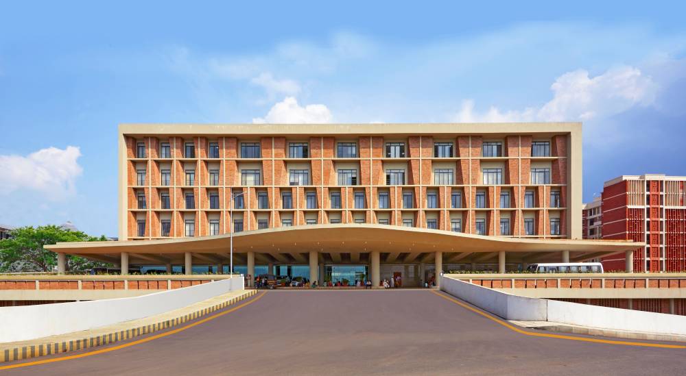
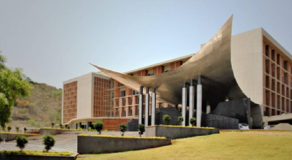
Firstly, it is crucial to define both -- the main entrance and the casualty entrance. An enunciated entrance with a canopy can be easily recognised and is relatable to any individual as an entry point. Preferably, it must be treated with a soothing colour to make the user feel safe and comfortable in an already tense environment. For instance, in our project, the Symbiosis University Hospital and Research Centre, two symbolic and significant entrances had been created for the hospital and skill centre respectively. The entrance for the Skill Centre draws inspiration from the stainless steel surgical instruments used in hospitals. A mammoth silver steel bird, with wings wide open, welcomes the visitor into the building. In contrast, the response to the other block is humbler. Split into two entries, where one is for casualties and the other for regular populous, the base of the entrance is lifted to be in line with the interiors. Above this large entrance, a slightly curved roof is designed, shading the entrance and making it possible for people to wait outside too. Access for the students and patients is therefore effectively separated.
In addition, within the hospital building, the various departments must be distinctly demarcated using some kind of imagery. Design features such as courtyards can help the user identify their location in relation to this space. At the Symbiosis University Hospital and Research Centre, the corridors across all floors abut a main central courtyard which becomes an identification point for the users. An additional layer of information in the form of signages can be added in such cases to simplify navigation further. Moreover, it is crucial to note the hierarchy of information on a sign board -- the most important piece of information must be the biggest and boldest.
Colour coding of the departments is an effective method of helping users identify the zones. Users can easily remember and relate the department to its respective colour, thereby simplifying wayfinding. However, it is vital to refrain from using agitating colours such as red, for they can do more harm than good.
Hospitals are spaces that cause immense anxiety and stress -- and as architects, our designs must be a tool to ensure maximum comfort for the visitors, patients, and the staff. An aspect as elementary as pathfinding can thereby prove to be beneficial in easing the users’ disposition significantly.
